What Really Grinds My Gears: Logo Plastering

Welcome to The Chronicles of Trevor, the blog that's the fire in the Columbia Torch Lady's torch.
Peter Griffin

Wanna know what really grinds my gears? Logo plastering.

According to the glossary of AVID, the Audiovisual Identity Database, plastering is "when a company deletes and/or replaces an older logo with either a newer logo from the same company, or a different company's logo". This practice has made preservation of older production logos harder to do.

If you don't know about AVID, it is a wiki that catalogues over 16,000 logos, television idents, VHS/DVD bumpers, test patterns, and other forms of audiovisual identities. This site has a large community of enthusiasts dedicated to the preservation and documentation of production logos and other forms of motion graphics. This group is known on the internet as the "logo community". You should check out the site in the link above!

But I digress. This blog post will cover some examples of the biggest offenders in logo plastering. 

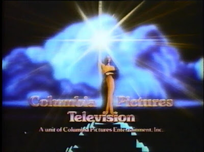
The most omnipresent logo in ALL of television has to be the 2002 Sony Pictures Television logo, known to many in the logo community as the "Bars of Boredom". This is because of its extremely common availability on programming, mostly due to it plastering older Columbia Pictures and TriStar Pictures related logos. Say, you were watching a modern print of a late 1980s episode of The Bold & The Beautiful. You would expect the 1988 Columbia Pictures Television logo to play, alongside its triumphant fanfare.

A woman holding a torch, dressed in an orange toga. Blue clouds aooear behind her. Columbia Pictures Television. A unit of Columbia Pictures Industries Inc.

But the Sigil Splicers at Sony want to scrub any signs of seasoned symbols. And BEHOLD!!!!!! The Bars of Boredom are the bane of the existance of many logo enthusiasts since its debut in 2002.

12 chrome bars that get shinier at the right side. These bars are on a blue gradient background. Under the bars is the text Sony Pictures Television.


This logo is like a raisin cookie disguised as a chocolate chip cookie, since logo enthusiasts have been looking for a logo for a TAT Communications Company, which is said to have been seen on the original One Day at a Time, The Jeffersons, and The Facts of Life. Below is a screencap from a 1980s aircheck of a rerun of One Day containing the logo in a partial form. The logo was unfortunately cut off by a CBS network ident, with a voiceover boasting that "This is CBS". Even though it's a partial find, it's still important, since it proves that the logo is out there and can be found.


An orange scanimated star engulfs the text TAT in a lined, Sega like font, The text Communications Company appears in a sans serif font below the lined letters above.


Sony also ruined a joke with logo plastering. In the Mad About You episode "That's A Wrap", Paul, while on the phone, tells a director to show the logos, resulting in a great use of biting-the-hand-that-feeds humor.
The 3 logos from Mad About You, complete with lines from the episode "It's a Wrap"
Sadly, Sony's Sigil Swipers Struck this Show's Syndicated Stock. The Pegasus was removed, and as a result, they changed it to the über-bland joke-cracker that is:
The same as before, but the Tri-Star logo is replaced by the bars of boredom.
...the "-s" being the cut off word "Wings"


With Sony's 2015 revival of TriStar Television, I'd want to see them bring back the "stupid horse with the wings" joke, since their revival just begs for that joke to make a comeback.

Other plaster kings are 20th Television, with their 2008 logo, and MGM with their 2000s logo that has the studio's website underneath the ribbon.

Say you're watching Dr. No, the first 007 film, and you see Leo the Lion proudly roaring, and the URL "www.mgm.com" underneath him. That movie is from 1967, and "www.mgm.com" wasn't registered as a web address until 1997. It is extremely confusing. And let's not forget the fact that United Artists, the distributor of 007 films, was owned by Transamerica Corporation at the time, NOT MGM.

Other than that, 20th Television is a logo I don't mind, since I've always liked 20th Century Fox logos. (except for 20th Century Studios)

That has been "What Really Grinds My Gears", and the first post of September! Thank you so much for reading!


No comments:

Post a Comment

My latest post!

The Devil's Horn: My Love-Hate Relationship with Harmonicas

Welcome to The Chronicles of Trevor, where the angels sing and the demons are silenced. I am a musician, and I can piece together instrument...