Welcome to The Chronicles of Trevor, the ONLY blog that can skim stars across a mountain like a champ!
Ever noticed that whenever you're watching a horror movie, that the production logos are always tinted red? A heavily-used cliché, amirite? or when you're watching a Star Wars film, and the 20th Century Fox logo is still? Even The Bob's Burgers Movie, from 20th Century Studios, has a variant of the iconic fanfare, played on ukulele and keyboard (complete with barking, whistling and armpit fart sounds)! That's because those are variants of said logos. Sometimes, the studios like to make fun creative choices with their logos, like how Warner Bros. used to open their family films with Bugs Bunny leaning on the "Shield in the Sky", while eating a carrot, complete with a loud crunch, All while the Merrie Melodies theme plays (said theme is now associated with both Looney Tunes and Merrie Melodies.)
Cartoon logic allows him to be standing on a groundless sky, for some reason.
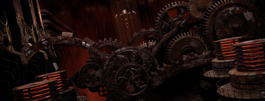
My favorite horror logo variant is the one for Canadian-American mini-major Lionsgate Films. Their 2005-2013 horror logo variant is similar in animation to the original, except the gears are all rusted, and the sky is a hellish dark red. The sound design for this variant was done by musician Billy Mallery, who would later compose the award-winning fanfare for their current logo, made in 2013. This variant is the reason why I'm making this post, since they brought this iconic logo back for Saw X, a movie that I haven't seen yet. I haven't even seen the whole Saw saga, or should I say, Sawga. LOL!
Other than that, All of the Saw movies had the Horror logo variant, alongside The Expendables, ...for some reason.Way to go, Lionsgate! Making a choice that ALL viewers can agree is amazing. If I were to go even further, bring back the original "Gears" logo, and the 2007 Summit Entertainment logo (the one used in all 4 of the Twilight films). Heck, I'd want to see Billy Mallery make an updated arrangement of the 2005 logo's theme.


No comments:
Post a Comment